Refer Lyvora to your network and earn up to 20% commission. Referrals: earn up to 20%. Learn about the referral programme (in French)

Message us on WhatsApp

Answers generated by AI (Mistral) from the pages of this site. Do not include personal information. Privacy

Assistant

Book a call

Answers generated by AI (Mistral) from the pages of this site. Do not include personal information. Privacy

Services · Shopify

Ecommerce web design agency for Shopify brands.

We design ecommerce websites on Shopify, from the art direction to the mock-ups and the design system. Every screen starts from your identity and from the way your customers buy.

Who it is for

  • An established brand on a generic theme

    Your products and your craft get lost in blocks found on thousands of stores.

  • An identity that has evolved

    The logo, the palette or the range has changed, and the store still shows the old identity.

  • A complex purchase journey

    Personalisation, made-to-order pieces, choice of components: buying takes more than a button and a list of variants.

  • A team that keeps the site alive

    You build pages and campaigns yourselves, and you want consistent sections that do not distort the design.

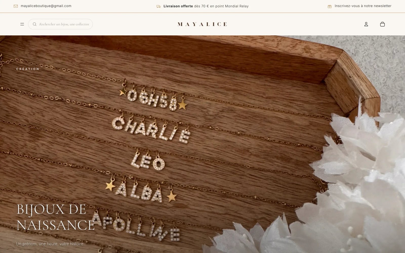
Mayalice home page on desktop: name necklaces in gold rhinestone letters on a wooden tray, headline “Bijoux de naissance”.
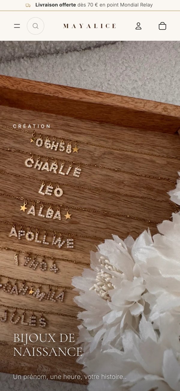
Mayalice home page on mobile: rhinestone name necklaces on a wooden tray, white flowers and the headline “Bijoux de naissance”.
Mayalice · Personalised jewellery · Shopify redesignRead the case study

Points to consider

Turning identity into interface

On a store, a brand’s identity shows in details: how a material is presented, the rhythm of a collection page, the tone of an out-of-stock message. A logo and a palette applied to a standard theme show only a small part of it.

We turn identity into interface rules: typefaces and sizes, image treatment, page density, button behaviour. If the identity itself needs to evolve, palette, typefaces or logo variations, that work is carried out alongside the site.

Designing for mobile first

For many brands, the phone is the store’s first screen. On mobile, the photo, the price, the variant choice and the add-to-cart button must fit on the screen and work with a thumb.

We design at mobile width first, then widen. Menus, filters, galleries and cart must work with one hand and stay fast on an average connection.

When the product is put together

On a customisable product, the interface guides the choices and shows the result before payment.

For Mayalice, each configurator shows a live preview of the piece of jewellery, and a photo of the final composition is attached to the order. This kind of journey is designed around the catalogue’s constraints: stock of each component, compatibility rules, production information.

Deliverables

The exact list is set in the quote.

  • Art direction and reference board
  • Purchase journeys mapped, mobile first
  • Mobile and desktop mock-ups of the key templates
  • Design system: typefaces, colours, components
  • Section library for the Shopify theme editor
  • States and edge cases designed
  • Contrast and keyboard navigation aiming at WCAG 2.2 AA
  • Shopify theme faithful to the approved mock-ups

Method

Each stage ends with your sign-off. Nothing goes live without your approval.

  1. Step 1: Brand study

    We gather the brand’s references, its products, its customers and its competitors. This work sets the art direction before the first screen.

  2. Step 2: Journeys and architecture

    We map how your customers discover, compare and buy. Each template gets a precise role, and the hierarchy of information is decided at this stage, starting with mobile.

  3. Step 3: Mock-ups

    Home, collection, product page, cart, editorial pages: mock-ups are drawn at mobile and desktop widths. You review them in Webcosa Aperçu and comment directly on the screen concerned.

  4. Step 4: Design system

    Typefaces, colours, spacing, components and states are documented so that every new page stays consistent. The theme’s sections follow this system exactly.

  5. Step 5: Build and finishing

    The design is built into a custom Shopify theme, with its micro-interactions and edge cases: sold-out product, long title, missing image.

Frequently asked questions

What is the difference between a Shopify theme and a custom design?

An off-the-shelf theme is a template shared by many stores, adjusted with your colours and images. A custom design starts from your brand and your catalogue, and each template is designed for them. The first is quicker to set up; the second sets the store apart and contains only what is used.

Can we keep our current logo and brand guidelines?

Yes. The store’s design starts from your existing identity and turns it into interface rules. If an element works poorly on screen, a typeface that is hard to read at small sizes for example, we suggest a targeted adjustment, without redoing the identity.

How do mock-up reviews work?

Each version is shared in Webcosa Aperçu, our review tool. You comment directly on the screens, in desktop and mobile versions, and each correction arrives in a new version. Day-to-day exchanges go through WhatsApp.

Does the design take accessibility into account?

We aim for WCAG 2.2 level AA: sufficient contrast, visible focus, keyboard navigation, large enough touch targets. These rules also improve readability for every visitor, on mobile in particular.

Will we be able to create new pages without breaking the design?

That is the role of the design system and the theme’s sections. You build a campaign or editorial page in the Shopify theme editor from blocks already designed, which keep the right typefaces, the right spacing and the right mobile rendering.

Does a custom design slow the store down?

Not if the weight of each element is watched. A custom theme loads only what the design uses, whereas an off-the-shelf theme ships options for every case. Animations, fonts and images are sized with the Core Web Vitals thresholds as the benchmark.